Author: Adam Bunker
What is a rage click?
Have you ever been so frustrated with the way a website or app operates that you feel an overwhelming urge to lash out? While you probably stop short of smashing your screen, you might very well find yourself manifesting that rage in a more subtle – but very trackable – way: a rage click.
So what is a rage click? It’s a series of clicks or taps in very short succession that denotes extreme frustration on behalf of the user. It should go without saying that rage clicks are a bad sign; your job as the owner or manager of the digital property in question is to figure out why rage clicks happen and fix whatever it is that’s causing them.

Rage clicks are typically the result of a ‘usual suspects’ list of everyday, infuriating website experiences – like slow loading times, confusing navigation, broken buttons, or annoying pop-ups.
In this article, we’ll explore what causes rage clicks, how you can use a digital experience analytics suite to track them, and what to do to fix their root causes.
Free eBook: The essential website experience & UX playbook
Rage clicks vs Dead clicks vs Error clicks
Rage clicks are just one of a bunch of behavioral feedback metrics that can help UX designers and technical teams understand how close their intended customer experience is to the one they’re actually getting.
The other key behavioral cues to keep an eye on are:
Error clicks
An error click is logged when the action doesn’t have the expected result, like a button not working, or a link being broken and landing the user on a 404 error page.
Dead clicks
Dead clicks are clicks on items of page furniture that have no interactive elements to them. Usually, this points to a UI misunderstanding, where a customer thinks something decorative is actually a button.
Important: Error clicks and Dead clicks can cause rage clicks – unexpected or frustrating results are what create that user anger.
Mouse thrashes
A mouse thrash is similar to a rage click in that it denotes frustration. You’ll pick up mouse thrashes whenever the user moves their cursor back and forth quickly in irritation – again, this is usually because something has taken too long, or doesn’t do what they expected.
Why should I care?
Businesses that care about the customer experience know how to put a strong focus on gathering customer feedback, but this focus often solely centers on what people say to and about them.
Rage clicks, though, are a metric of behavioral feedback, which lets you capture what people feel, think and do – giving you a more complete picture without them needing to tell you about their experience.
That can be really powerful because that bigger picture will show you where your user experience is leaking customers. For instance, some 90% of consumers will drop an app if it performs poorly, while 43% won’t come back to a site that takes an age to load. And ‘an age’ doesn’t have to be long. 40% will leave a site if it takes longer than three seconds to load.
Likewise, 75% of consumers will ditch a website that isn’t mobile optimized, and poor UX will make 88% bounce once and for all.
But again – they’ll often leave without telling you. In fact, research shows that around 96% will leave without complaining after a poor experience, leaving you in the dark as to what happened.
Fundamentally, rage clicks are a signal of frustration. For many businesses, these signals go unnoticed, which leads to poor CX and the risk of lost revenue – either because customers can’t complete a purchase, or because there’s an increased cost to serve when it comes to the resources needed to handle customer support issues.
And, as always, it’s worth remembering that the opposite is true; for every $1 you invest in UX improvements, you stand to make up to $100.
What causes rage clicks? Examples to look out for…
With rage clicks being the result of poor online experiences, it’s probably not hard to guess some of the likely culprits. How many times have some of the following examples caused you to get mad at your device in the past?
1. Slow loading times
Web pages that feel like they take eons to load – even if it’s actually just a few seconds longer than the norm – are guaranteed to annoy your customers. Performance issues can anger users and cost you sales if people decide to bounce after they rage click.
2. Confusing navigation
Poor UI is in evidence whenever people don’t know how to get around your site or app. If your users find getting around to be a clunky experience, or if they find themselves fighting against their expectations, they’ll leave frustrated.
3. Unclear buttons and interactivity
Sometimes what seems obvious as a decorative part of your site’s design to you might seem like an obvious button or CTA to others. If you can’t see the wood for the trees when it comes to UI elements, you run the risk of building an experience that confounds user instincts.

4. Dead or broken links
Whenever you set up any new page or link, it’s really important that you double-check that those links go where they’re supposed to. If older content gets archived, the destination page breaks, or if the link itself is just plain incorrect, your users will end up in a frustrating dead end.
5. Pop-ups
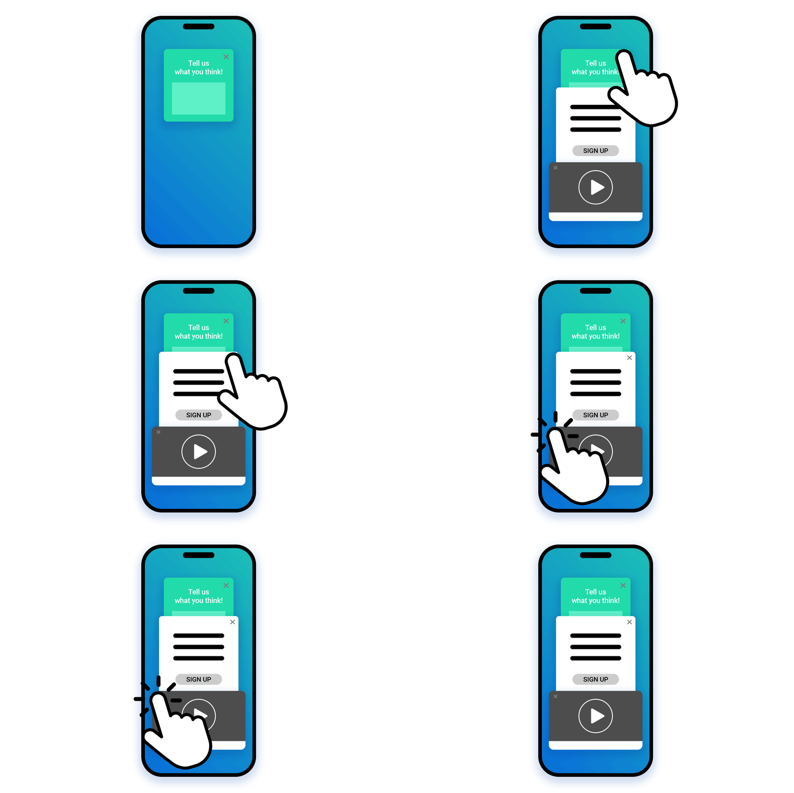
Nobody likes pop-ups, but when implemented carefully they can be useful tools for capturing things like email signups or customer feedback. The key here is to use them sparingly. If a user is trying to shop for a product or use your tool and half their screen is suddenly bombarded with pop-up boxes and adverts, they’ll justifiably get annoyed – especially if closing them feels like playing a rigged game of whack-a-mole.

How to track and monitor rage clicks at scale
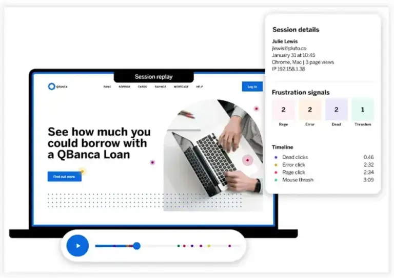
Capturing rage clicks isn’t something you can do manually – unless, that is, you plan on peering over the shoulder of everyone who uses your site. Instead, you’ll need to lean on digital experience analytics tools that offer Session Replay features.
Session Replay is a visual reproduction of users’ journeys through your site or app. Instead of making a recording – which could violate people’s privacy – these reproductions are pieced together by tracking mouse or tap events registered in the back end.

A good analogy for how this works is LEGO. Imagine a customer sits down to make something out of LEGO bricks, and every time they snap two blocks together, you make a note of it. After they leave, if you then give all those notes to someone else, they’d be able to faithfully recreate the customer’s creation in the exact same order – even if they couldn’t see them make it at the time.
Four things to remember about session replay:
- Session replay isn’t a screen recording
- Session replay doesn’t follow users from site to site
- Session replay tools are built to shield private user data (like login credentials)
- Most session replay tools offer the chance for users to opt out
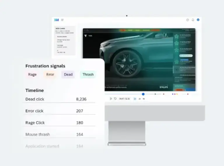
The result is a digital recreation of user experience that can be aggregated and mined for rich behavioral insight. Rage clicks, dead clicks, error clicks and mouse thrashes are all tracked via session replay tools, with an overarching digital experience analytics suite – like that offered by Qualtrics – there to turn the behavioral signals from every session into actionable insights.
The really powerful thing here is that you don’t need to ask your customers a single question – they’ll be giving you the answers you need just by using your site.
And the insights you generate are how you’ll go about tackling the next part of the puzzle…
What to do next…
If you can track rage clicks, you’re using software that should be able to tell you what’s causing them. The next step is turning what you learn into action – and doing so in a way that also addresses the structured and unstructured feedback your digital experience analytics suite is capturing across other channels.
Session replay and behavioral heuristics will give you a rock-solid understanding of your customers’ broken digital journeys and your digital channels’ drop-off points. If for example, you spot a common trend in people rage-clicking due to page load times, you’ll know to divert your energies into optimizing the back-end. If, on the other hand, the lion’s share of rage clicks are caused by a challenging route to checkout, then that’s a UX design issue that needs to be quashed.

Ultimately, when you know what’s causing your customers to get frustrated and, likely as not, leave your digital channels in the process, you’ll know what needs to change.
The key is in being able to do this at a scale that can surface trends from individual experiences – and that requires a digital experience analytics solution that can track every interaction on every channel at once and surface insights that no human could.
That means being able to combine behavioral insight with solicited and unsolicited feedback on every touchpoint.
And that’s exactly what Qualtrics Frontline Digital excels at: omnichannel analytics that cut right to the heart of customer behavior to help you make decisions that drastically increase retention, loyalty, and satisfaction.
Free eBook: The essential website experience & UX playbook